UI/UX Designer on Life Eater
Intro
I was the UI/UX Designer on Strange Scaffold's Life Eater, I'll let the Steam blurb speak for itself:
If you don't sacrifice your neighbors, the world ends. Life Eater is a horror fantasy kidnapping simulator where you must become intimately familiar with your targets' lives one intrusive action at a time... and hope that the dark god you serve is even real.
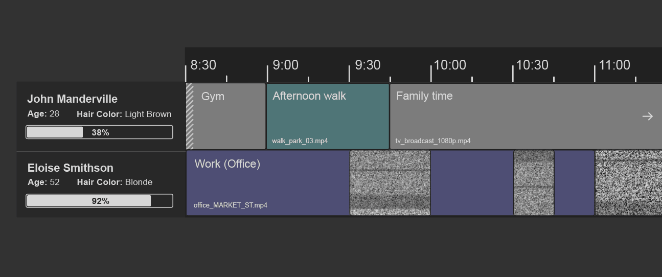
The game uses a video editor-inspired interface, where the player has to select which activity blocks to investigate in their targets' schedules, both to identify who they are meant to sacrifice that year and to figure out the best time for their abduction. A classic example of a cozy game to unwind to!
I started writing this up as a portfolio case study, but I love talking about process, so I've framed this as a step-by-step development overview of Life Eater's UI.
Identifying references
I started by gathering interface references of video and audio editing programs that had a timeline component in PureRef, and added screenshots of the existing prototype's UI side-by-side so I could keep in mind the core functionality we wanted to support alongside the visual inspirations.
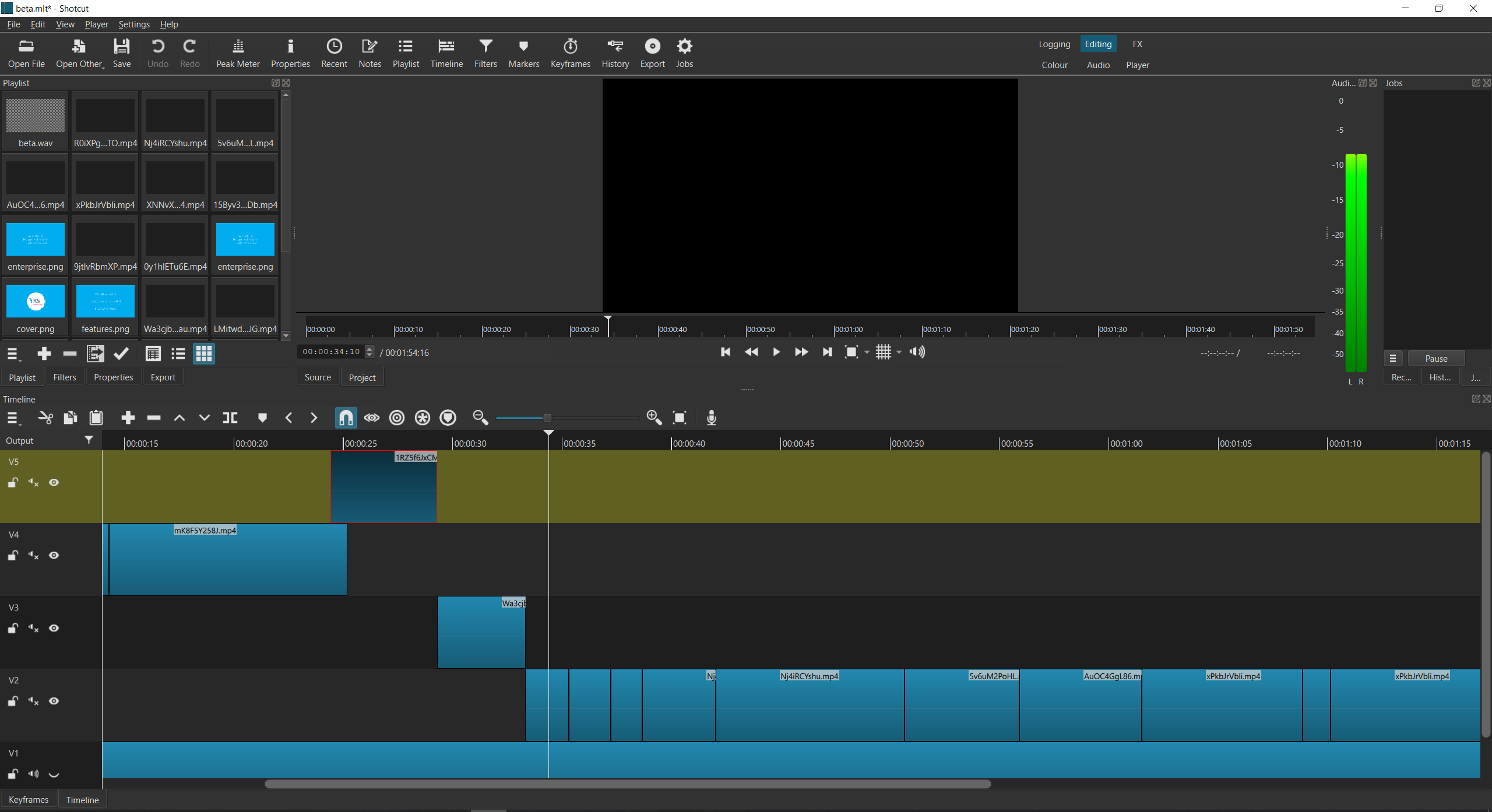
I was also looking at point-of-sale systems as references of overwhelming, impersonal interfaces, but it turned out Xalavier is also a fan of the open-source video editor Shotcut, so we zeroed in on it as a primary visual reference. Notice the rows of cramped, chunky icons; Shotcut is not about fancy gradients or giving text plenty of padding. It's focused on being functional and providing you with all the complex information you require to do your work. That's the vibe we wanted for Life Eater's interface.

Sketching the core UI element
I focused on the visual design and layout of the timeline component first, as it was the main interaction area for the game and would inform how the rest of the interface would look.

I tried out some effect filters on the mockup to better visualise what the UI could look like in-game, to get a feel for whether the direction would fit the "haunted Shotcut" aesthetic we were aiming for.
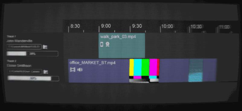
I also mocked up the visual feedback we'd want to give users when they interact with the timeline (using Photoshop layers and ScreenToGif to quickly fake interaction). You can see ideas on how to represent spans of time that stretch beyond the currently zoomed-in area, and locked activity blocks. We removed icons from activity blocks, so that players wouldn't be led to think there was accompanying in-game audio/video for each block.
Collaborating on making the gameplay rules explicit
Since I wasn't involved on this project from its inception, I needed to quickly catch up on what the intended gameplay and mechanics were. This would also mean I could be more helpful during build reviews in providing useful thoughts on the game's design. I was only working a few hours a week on the project, on the side of my full-time job, so I needed to make sure I had a clear idea of what the UI needed to include from the get-go.
I wrote out the game rules, goals, variables and questions I had about them in a bullet pointed document, as if I was writing a TTRPG rulebook for the game. Writing things down concretely in this way brings to the surface any existing vagueness in the game mechanics or my understanding of them. We ended up reviewing this document in a group call, line by line, which helped ensure we all had the same understanding of how the gameplay was intended to work. It was easier to identify elements to change or simplify when the entire gameplay loop was laid out in a few pages; it also enabled us to agree which variables would be visible for the player, and thus I needed to include in the UI, and which would be behind-the-scenes stats.
Designing the overall interface layout
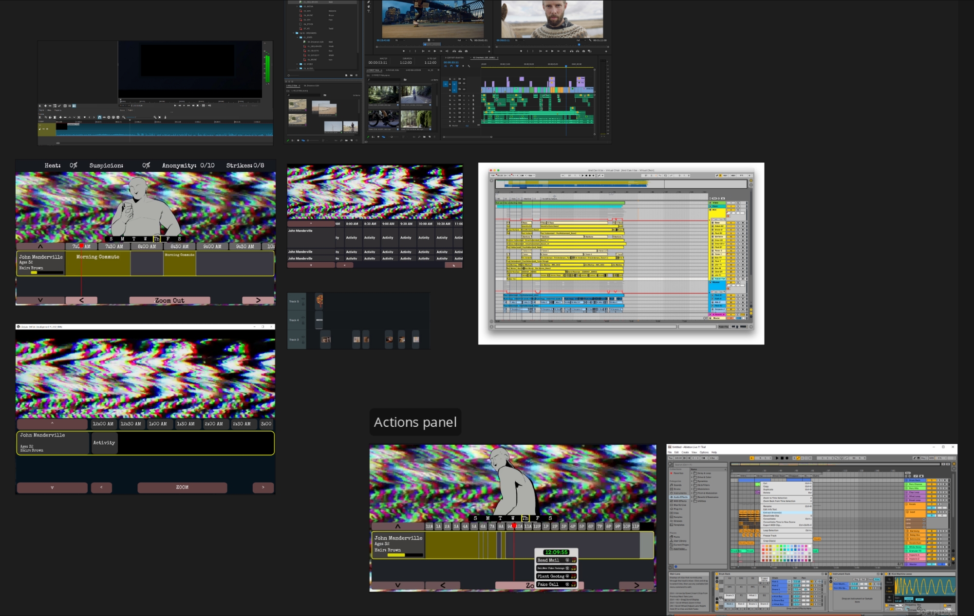
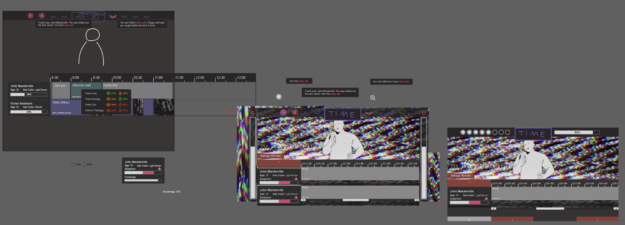
To build out the rest of the UI, I used a screenshot of the existing prototype as a background, and layered placeholder elements on top of it to visualise possible layouts; alongside that, I'd be exploring variations on each of the elements as well.
Showcasing the UI elements in context of the wider interface makes decision-making easier on what works and what doesn't, but it does mean developing any elements that interact together in parallel. The goal is to enable the creative leads to make informed calls on the direction and slowly narrow down on a first version of the full UI. My Illustrator artboards end up looking like collage experiments, with elements at different levels of polish next to each other!
Since this was an interface and numbers-heavy game, with various progress bars and actions that impact several stats at once, a lot of the work consisted of figuring out how to present all this information in a clear way for the player, ensuring elements were aligned and visually consistent, and making best use of available space. At this point, I'm switching to a consistent Illustrator artboard dimension, to make sure I'm designing the UI with our target resolution in mind.
Things look out of place and unfinished for a long while. Here's what it looked like when I was mid-through the first full interface draft.
Below is what the first finished draft looked like. A lot of the icons came from iconmonstr, which I use often for free-to-use icons to rework and combine into what is needed for a project. It was especially useful to not spend time drawing icons from scratch too early on in the design process, as the game's design itself is likely to change, along with stats being removed or combined into new ones, resulting in icons being discarded.
I try to show different states that an element can have within the same mockup: filled and unfilled bars, on/off versions of icons, revealed/unrevealed/highlighted activity blocks. This helps with checking that all variations fit within the overall visual style.
Iterating
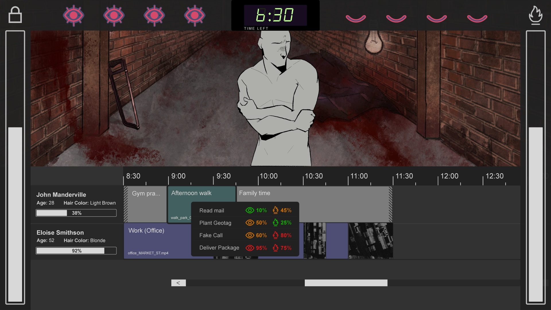
Initially, having the risk bars on each side of the screen was meant to make the player feel boxed in, adding to the oppressive feel of the game. However, we ended up moving the bars to the top to both give the timeline more horizontal space to work with, and to group all the core information in the top area. This avoids players having to look left and right to keep track of those stats, and meant that effects of actions on specific stats are easier to notice.
The mockup below added additional elements: the actions panel, a collapsible downtime panel, as well as weekday navigation. Some elements would be exported and pulled into our development build to see how they fit in action, and this would inform further visual iterations.
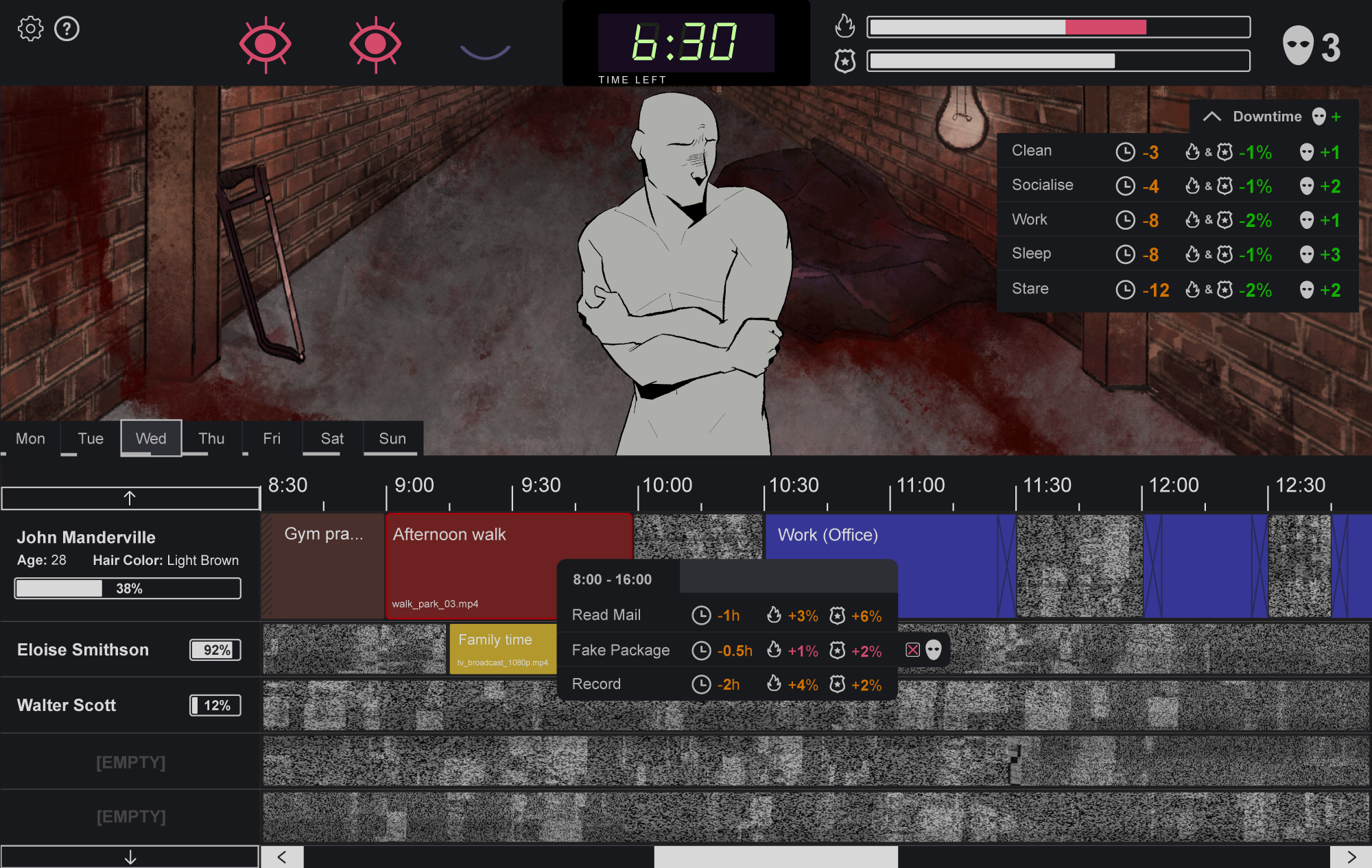
And here's the final mockup (spot the differences)! I provided versions of this mockup with different activity block colours, so we could decide on whether to use a bright colour palette, a singular primary colour, or a more monochrome look.
The workspace
My main Illustrator file ended up a mix of artboards for exporting specific components, reference images, colour palettes, and quickly jotted ideas and task lists during co-working sessions.
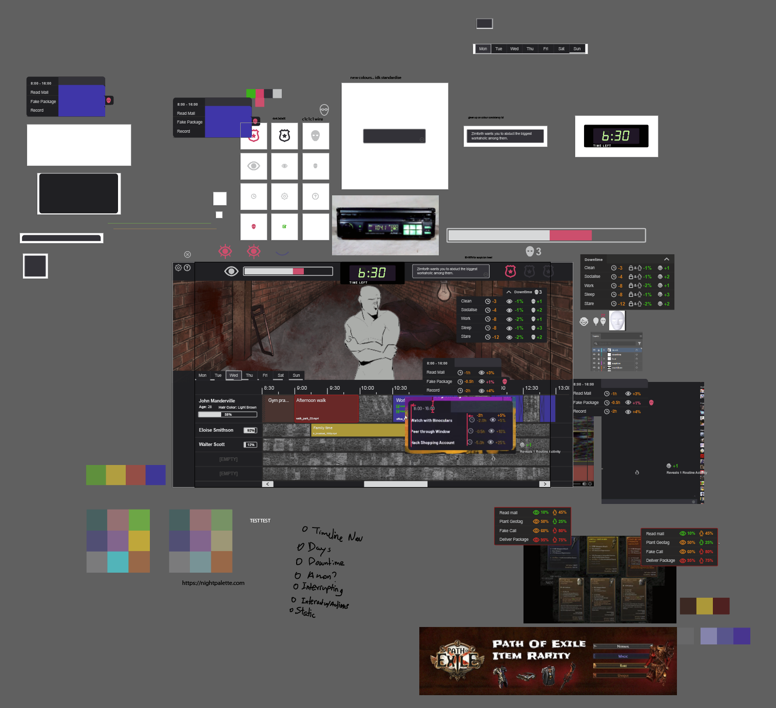
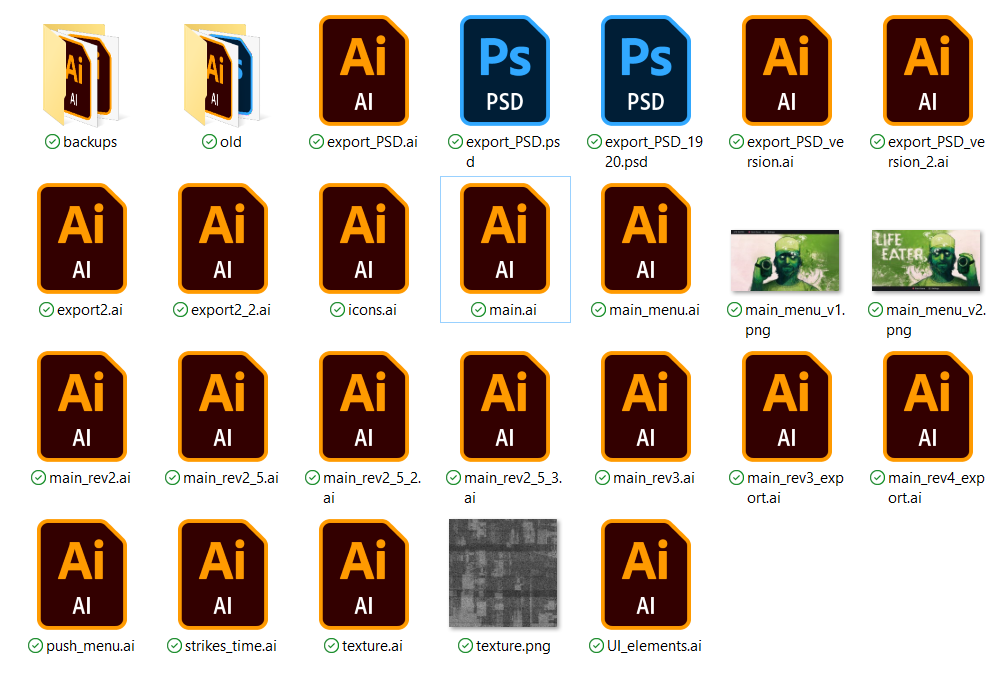
My project folder was itself a mix of different revisions of different parts of the UI. The process is inherently messy! Any aesthetic shareable images for portfolio purposes have to be intentionally dug out from that mess.
Handoff & final look
The UI was then handed off for an art and VFX pass to really give it that "haunted Shotcut" vibe.
On my side, this involved exporting individual components using a standardised naming convention to make things easy for our developer (essentially, type_component_state_version.png). Luckily, converting the Illustrator file to Photoshop was straightforward, so our artist was able to directly work with the individual layers of the final mockup file. In future projects, I'll keep in mind to check with the leads what the asset pipeline might look like ahead of time; that way, if I know that someone else is going to be working with the original Illustrator or Photoshop files, I can ensure I'm categorising my layers in a more navigable way for someone else to work with.
My contribution to the project was mostly finished; I did provide some additional feedback on the UI's implementation in-engine, regarding alignment and interactivity.
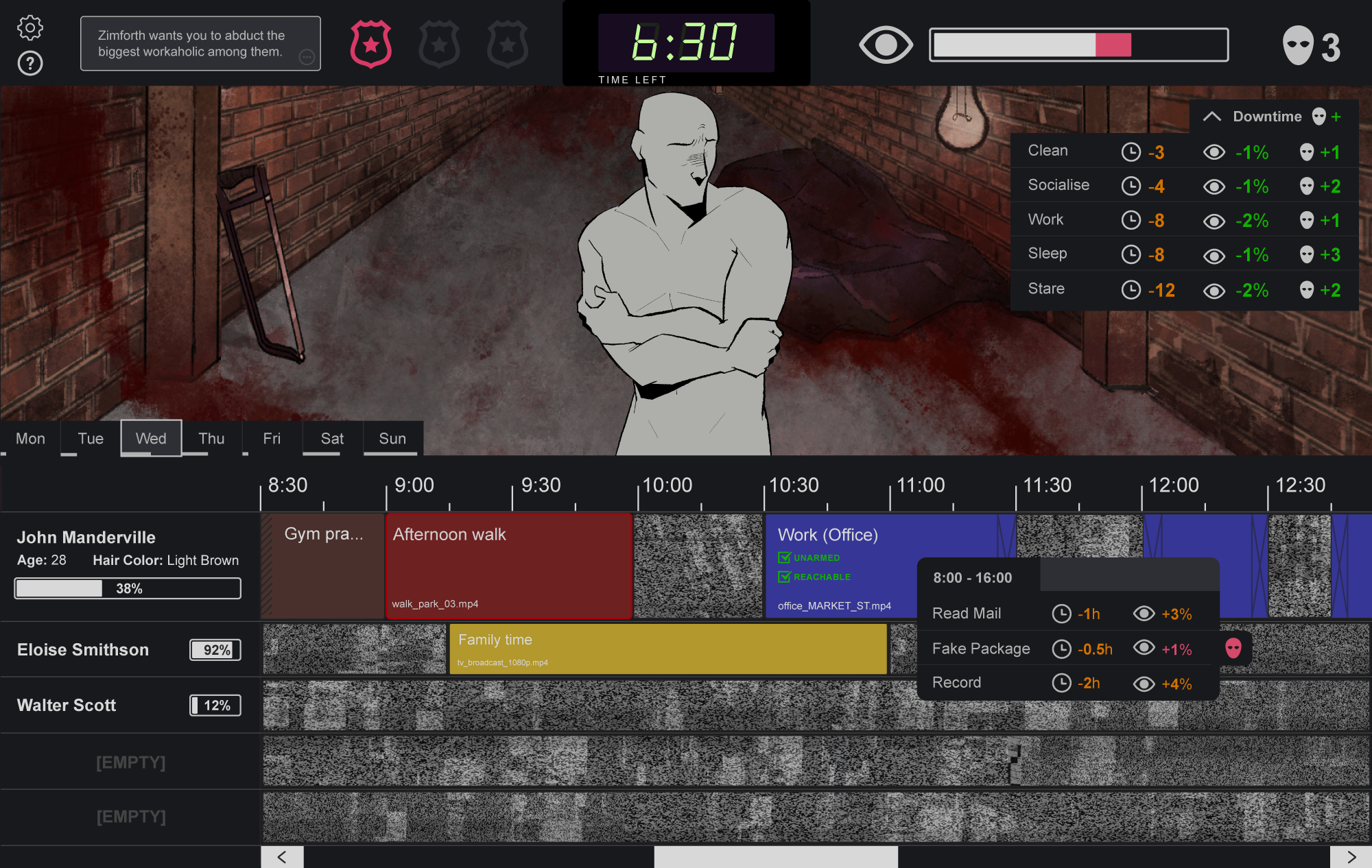
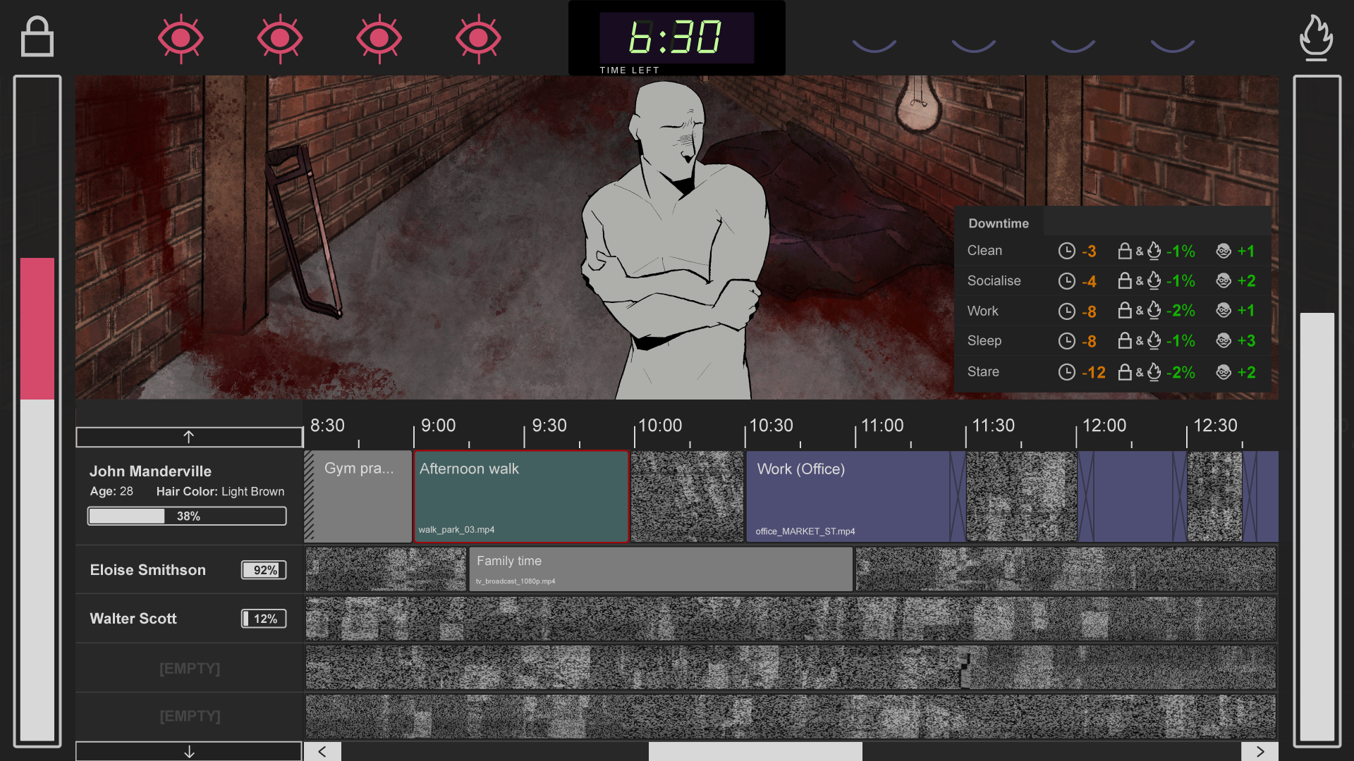
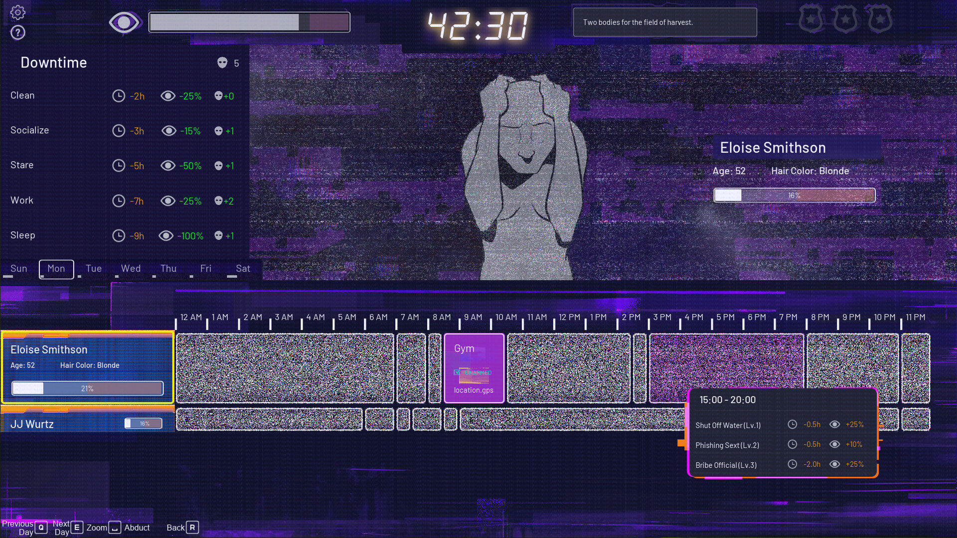
This is what the game looked like on release:
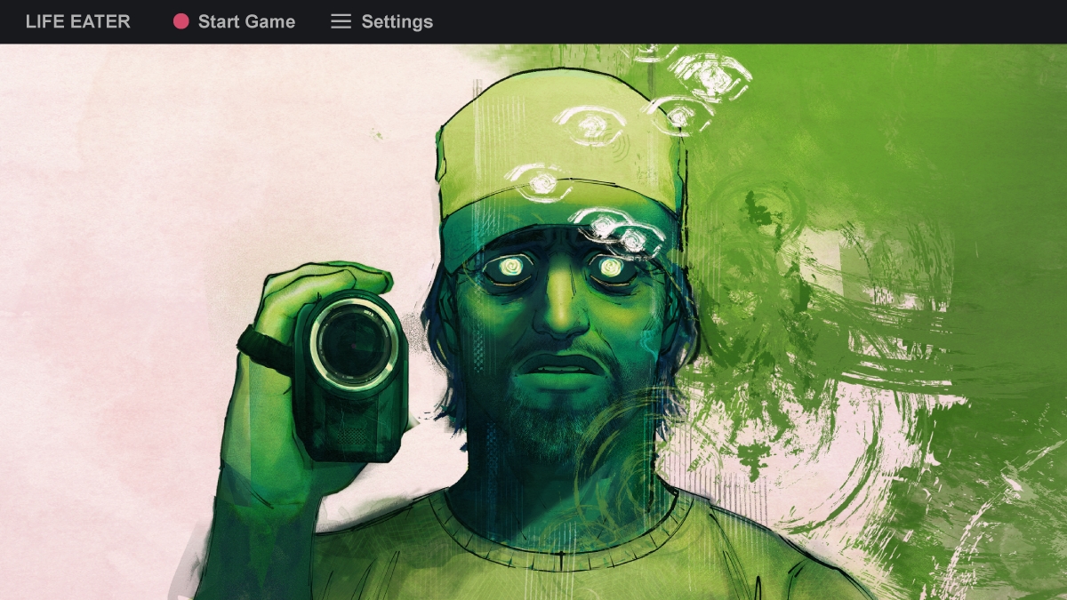
Bonus: main menu layout
I also quickly threw together a couple simple main menu variations, one with the key art containing the game title, one without. I'm glad we kept the live recording red dot as an icon for the Start Game button!

Closing thoughts
And voilà! Thanks so much to Strange Scaffold, the Life Eater team for being lovely to work with, and Xalavier for taking a chance on me on this project. It was my first time working on a commercial game, and as part of a team at a game studio, and I learnt so much about so many things during it!
There was a really cool moment after release, when I was randomly on YouTube's Trending Games tab (which doesn't exist anymore, RIP), and noticed a Markiplier video that had an awfully familiar thumbnail. I then realised it was his playthrough of Life Eater! A game I worked on, on the YouTube Trending tab (RIP)! I had somehow missed the Strange Scaffold Discord message about this, and it was so nice to encounter the video purely by chance and have the genuine realisation moment of what it was!
If you're interested in Life Eater:
- check it out on Steam
- watch Markiplier play it
- read the NME review; they've listed Life Eater as one of the best games of 2024 so far!